Visually Determining Normality in R
Much of what we do in statistics requires that the data we are using be normally distributed. This prolific assumption requires that we either visually inspect the data or use a hypothesis test. While hypothesis tests like the Shapiro-Wilk test offer a clear-cut decision (most of the time), it is sometimes preferred to simply visually inspect the data. The way we can do this is through the use of histograms and quantile-quantile plots (QQ plots). I have created a special histogram function that will superimpose a theoretical normal density with an appropriate mean and standard deviation. In red, there will also be the actual distribution density to allow easy comparison between the actual density and idealized density. This allows us to get a better sense of the normality of our data.
# A function that produces a histogram with superimposed densities
hist_density <- function(x, title = "Histogram with Superimposed Densities",
x_label = "Random Variable", rm.legend = FALSE){
# The range of values the density is plotted upon
value_range = seq(min(x)-1, max(x)+1, length.out=1000)
# we want to compare against a normal distribution
density = dnorm(value_range, mean = mean(x), sd=sd(x))
# generates the histogram with the density being the y axis
hist(x, freq = FALSE, ylim = c(0,max(density(x)[[2]]+0.15)), xlab = x_label, main = title)
# Plots the theoretical normal density in blue
lines(value_range, density, col="blue")
# Plots the actual density in red
lines(density(x), col = "red")
# generates a legend that distinguishes the actual and theoretical densities
if(rm.legend == FALSE){
legend("topleft", legend = c("Actual Density","Theoretical Density"),
col = c("red","blue"), lty = 1, text.width = strwidth("Theoretical Density"))
}
}
I want to start by talking about one of my least favorite questions I have seen on introductory statistics exams. The basic question presents a histogram of a very small sample size, and the student is asked if the distribution looks normally distributed. The reality is that data with a small sample size that truly comes from a normal distribution will rarely appear that way. This data will often either look uniformly distributed or like a normal distribution that is heavily skewed. In my opinion, this type of question is unfair, because the features the students are taught to recognize are not sufficiently distinct. To illustrate this point, I made a small simulation drawing a sample size of 10 from a standard normal 9 times. In the plots below, if you look at just the bars you might guess that the data sets are non-normal, when we know this to be untrue. It isn’t until you look at the super-imposed densities and QQ plots that you get the sense that the data may very well be normally distributed. I will elaborate on QQ plot interpretation later, for now just know that for QQ plots we want the points to adhere to the plotted line as closely as possible. Remember to use the par(mfrow=c(1,1)) to return plotting to normal, or you will be stuck plotting on a 3 by 3 grid!
# Illustration that small samples drawn from a normal distribution will not appear normal
# Changes plotting to be 3 by 3
par(mfrow=c(3,3))
# Plots histograms for random draws from a standard normal with n = 10.
for(i in 1:9){
set.seed(i)
hist_density(rnorm(10), title = paste("Plot ",i,", n = 10",sep=""), rm.legend=TRUE)
}
# Creates QQ plots for identical random draws.
for(i in 1:9){
set.seed(i)
Temp <- rnorm(10)
qqnorm(Temp, main = paste("Plot ",i,", n = 10",sep=""))
qqline(Temp)
}
# Changes plotting back to normal
par(mfrow=c(1,1))
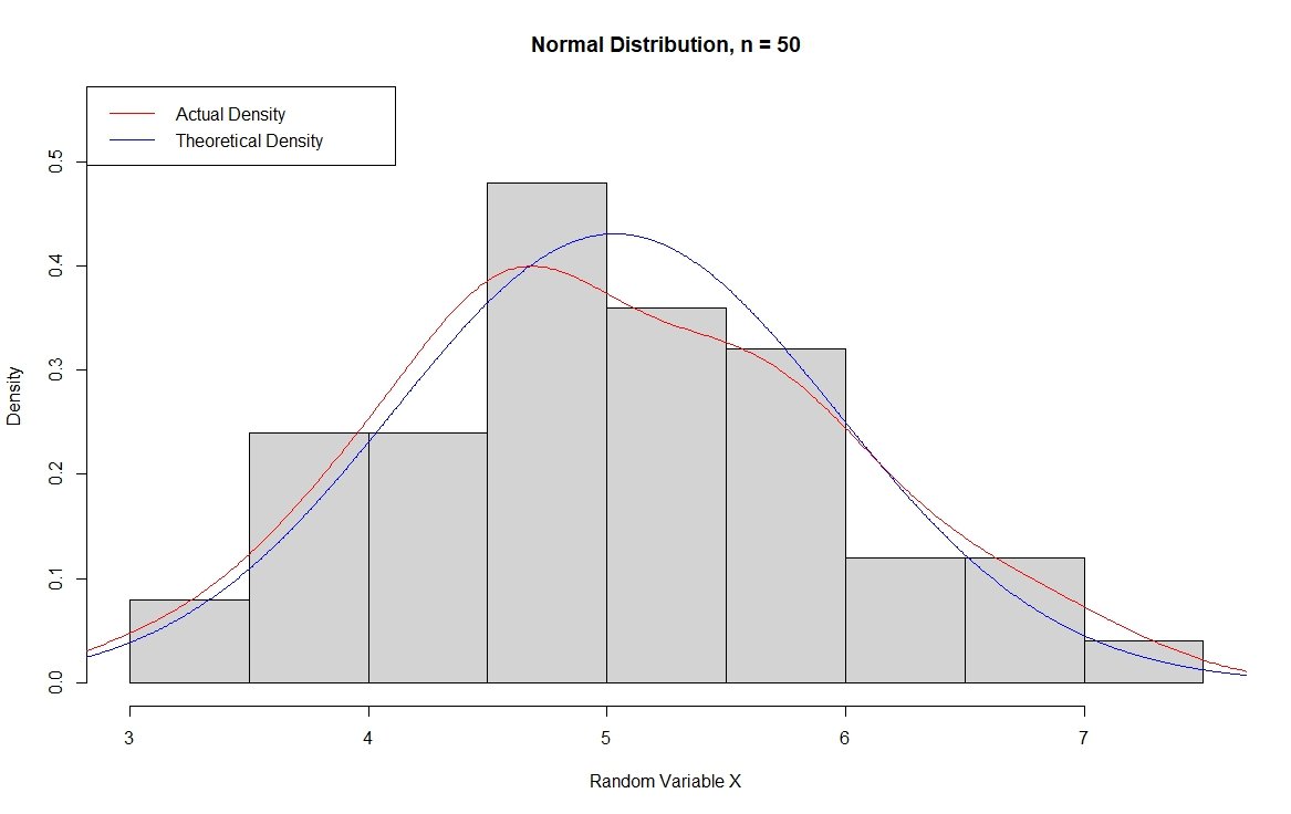
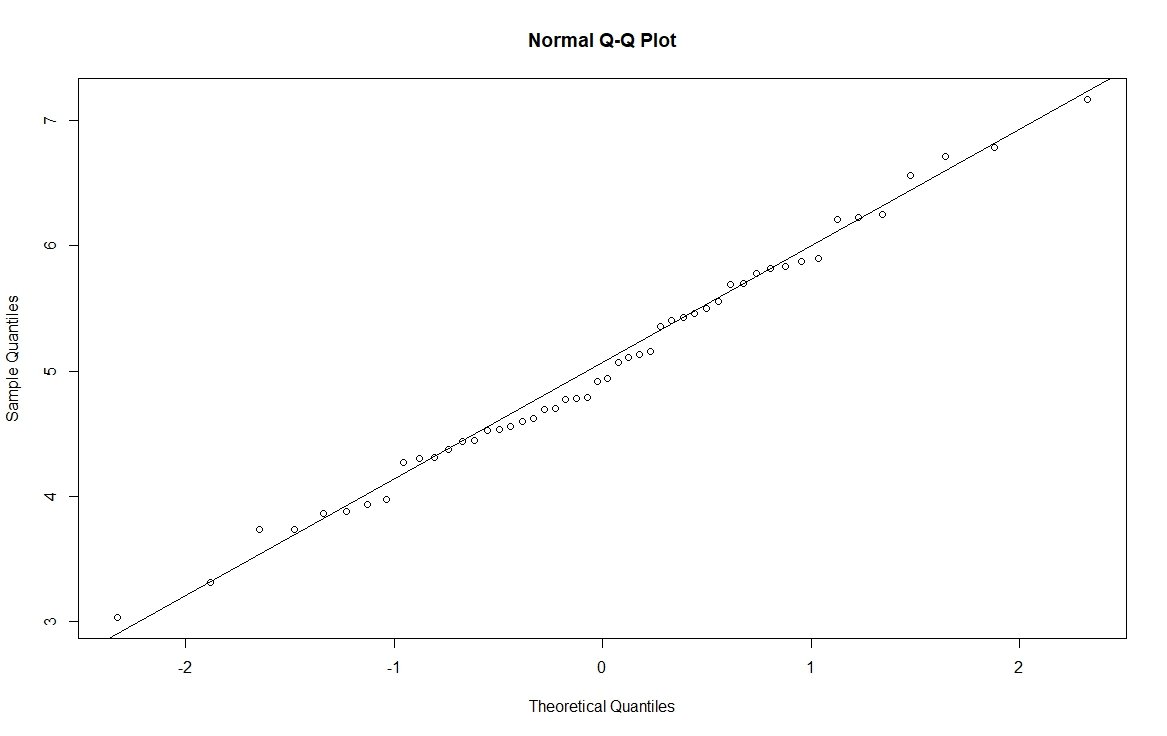
Now, I want to move to examples that make more sense for real applications, so I am going to use a sample size of 50. On the histogram, you will notice that the actual and theoretical densities match well, with the peak of the actual density falling a bit short of the theoretical peak. In the QQ plot, the points fall on the line well, illustrating that the distribution is dispersed the way we would expect if the distribution is in fact normally distributed.
# Normal Histogram data to plot
set.seed(123)
x = rnorm(50, mean = 5)
# Histogram with super-imposed density
hist_density(x, title = "Normal Distribution, n = 50", x_label = "Random Variable X")
# QQ plot of the data with line
qqnorm(x)
qqline(x)
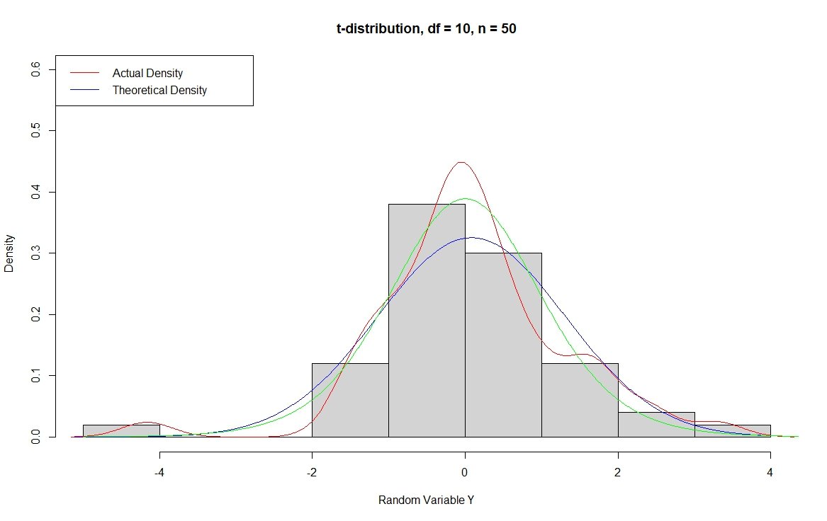
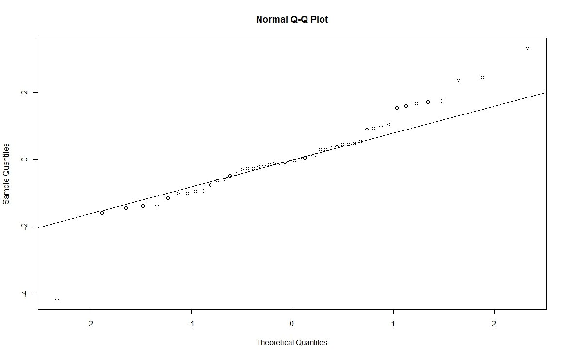
In contrast, we have the t-distribution which has “heavier tails” meaning that the distribution is more spread out. For this example, I am going to use degrees of freedom 10 where we know that as the degrees of freedom increase, the distribution becomes closer to a normal with degrees of freedom of 30 being approximately normal. With a t-distribution, we expect the peak to be taller and more narrow with more of the distribution in the tails. You can confirm this to yourself by increasing the sample size below in the rt() function from 50 to 5000. You can also look at the theoretical t distribution with degrees of freedom = 10 superimposed as a green line on the histogram below for illustration, although this method does not show the heavier tails well. In the QQ plot below, you can see that the dots are systematically above the line on the right and there is a point below the line on the right. This is characteristic of a heavy-tailed distribution; the opposite relationship can be found for a light-tailed distribution. An illustration of a heavy and light-tailed distribution can be found in my book starting on pg. 47 here.
# t-distribution degrees of freedom 10
set.seed(123)
y = rt(50, df = 10)
# Histogram with super-imposed density
hist_density(y, title = "t-distribution, df = 10, n = 50", x_label = "Random Variable Y")
lines(seq(-5,5,length.out = 1000), dt(seq(-5,5,length.out = 1000), df=10), col = "green")
# QQ plot of the data with line
qqnorm(y)
qqline(y)
